a2 media
Sunday, 7 May 2017
Friday, 5 May 2017
Thursday, 4 May 2017
Evaluation Question 2
Question 2
How effective is the combination of your main product and ancillary texts?
I believe that I have incorporated a lot of synergy between all three of my tasks, the trailer, the magazine cover and the movie poster. I did this in many different ways when making each individually.
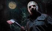
 The first task I developed was my Film trailer, in which I used many stylistic elements that would carry over into the other tasks. The biggest example of this is the movie's slasher villain. I decided to make the villain the centre of the marketing for the movie as previous slasher franchises have used their own villains, such as Freddy Krueger and Jason Voorhees, as the single embodiment of the movies, something which I am replicating here. This can be seen in how i am using my movie's villain on all three tasks, with the closing images in the trailer being of the villain, and the character
Then I moved onto my movie magazine, wherein which I needed to decide what my overall house style throughout all three tasks would be. I decided that the best option for my house style would be a combination of red, black and white. The colour of red is a symbolic code for blood, danger and violence, and therefore it represents what a horror movie will often feature. The black and white contrast well with the red, making the text in red stand out more in bold, as well as black being symbolically representative of darkness, death and night, all of which factor into my horror movie.
The magazine features the same font for the movie's title, which further continues the synergy and helps the text become distinct and more recognisable, as a viewer would have seen it multiple times in the movie's marketing campaign. The same font for the movie's title was also used on my poster for the aforementioned reasons.
To conclude, the combination of my main task and my ancillaries has helped create a level of synergy through all three, with changes being made to each task to help improve each piece and the consistent features and conventions of each.
To conclude, the combination of my main task and my ancillaries has helped create a level of synergy through all three, with changes being made to each task to help improve each piece and the consistent features and conventions of each.
Subscribe to:
Comments (Atom)

