Showing posts with label Developing My Magazine. Show all posts

Tuesday, 25 April 2017

Movie Magazine inspirations


Developing my magazine part 7

In the next part of my development process, i have added some of the smaller details that are often seen on magazine covers, especially Empire magazine. The tagline i have included under the masthead is the one that is a common feature of Empire magazine, and the line itself,"The World's Biggest Movie Magazine" calls out the pedigree and popularity of the magazine. I have also added the conventions of the date and price onto the magazine, and i did this in order to fit more with the standard layout of a magazine cover, and the price i chose was representative of the style model, Empire, and its pricing.

Friday, 21 April 2017

Developing my magazine part 6

I have added more to the bottom of the cover, because it previously looked very open and with very little in there. This is why i decided to add another cover line, this time i decided to show another interview, in order to make the magazine look like it has plenty within. This time, i decided to make the interview about Quentin Tarantino, who is a internationally acclaimed director with his own following and could draw in new readers who are only there for his interview. The pulled quote from the interview is "Why i'm only making 10 movies" and this is a good way to get interest from the reader as it is a answer to a question on Tarantino retiring at 10 movies that as of now has no concrete answer. I have also added a barcode onto the cover in order to further replicate the authenticity of Empire magazine, which has often had the barcode at the bottom right of the screen.

Developing my magazine part 5

I have added more conventions to my magazine that show that there is more in this magazine than just the main headline of my film. I have shown through cover lines that there are more films within the magazine. I decided to pick some of the biggest blockbusters of 2017 in order to make the magazine more appealing to a wider audience. I have also added a skyline with the phrase "world exclusive" as this makes the magazine content appear more unique and exclusive to only this magazine issue.

Developing my magazine part 4

The next crucial element of my magazine i have decided to include is the anchoring text for my headline, which serves to give the reader more information than just the name of the film. The anchoring text here sticks to the same house style i have consistently been using, and i highlighted the word "biggest" in capital letters in order to make it bold and eye catching and the word itself gives the reader a impression of what the scale and production value the movie has. I also decided to include a quote from the production, and i did this because it immediately lets the reader infer that there is a interview inside where the quote is pulled from.

Wednesday, 19 April 2017

Developing my Magazine part 3

Next on the development of my magazine, i decided to add another key convention, being the headline of the magazine, in this case the movie's title "Tenebris". This is done using the same font that i have used on both my movie trailer and poster, and maintains the consistent house style of both the colours and fonts used.

Developing my magazine part 2

The next thing i have done is add the Empire masthead, which is a key convention of my magazine, and it is placed at the area where my style model, Empire itself, always places its masthead. This is important for the magazine to look like a authentic magazine that Empire would publish. I chose Empire over Total film and other movie magazines due to its size, as in my opinion it is the biggest UK based magazine.

Developing my magazine part 1

The first thing i did was decide on my photo i was going to be using for my magazine. i eventually decided on this one as the photo is medium close up, and this follows my style models of the Empire magazine. The filter i decided to use has enhanced the photo in contrasting the slasher with the brick wall behind him, as the original photo had very little to make the villain stand out. Here, the jacket and features of the mask serve to stand out more, and the brick wall has this effectively grey background, which further acts to make the villain stand out on the cover.

Friday, 3 March 2017

Movie Magazine Ideas:

For my magazine i was deciding between two different magazines for a primary style model, being Empire and Total Film respectively. I ended up eventually choosing Empire, due to my familiarity with that magazine brand and the overall layout of the conventions on the front cover. The magazine will have a house style of red and black, as these colours are symbolic codes for danger, darkness and blood. The main image will be of the villain of my film, as it is the most marketable and recognisable part of the movie, and like horror icons like Jason Vorhees and Freddy Kreuger, will come to be symbolic of the film.


Friday, 17 February 2017

Developing my Movie Magazine: Layout

This is the planned layout for my magazine, and is subject to alterations as i take my photos

Tuesday, 7 February 2017

Movie Magazine Ideas

I have planned to make my magazine cover for my magazine have considerable influences from the likes of Empire and Total Film. The cover will feature the standard conventions of magazine covers for example it will feature a masthead, headline and tagline and others. I am likely to base the overall issue more on Empire as they are more popular and recognisable, but also due to the way they use their mast head in conjunction with the main image. 


Tuesday, 31 January 2017

Empire magazine style model

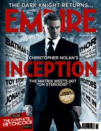
There are several different conventions of movie magazines, and Empire contains some of it's own unique features. The first would be the bold and distinctive masthead, which has a red font that is synonymous with the Empire brand. This is placed behind the character on the front cover, and this is usually done in order to show this character, in this case Kylo Ren, who is very popular and recognisable, causing people to gain more interest.

There is a distinct colour scheme on the page, that of red, white, silver and black, and this was chosen in order to reflect the characters own design and surroundings. I could incorporate this into my own trailer by having the house style reflect the main villain, for example i could use the red of the Empire masthead in order to representing blood.

The cover also uses some minor but still important features, such as the date, price, barcode and more, and all of these conventions are going to be included in my own front cover.